Project Scope: Research & Analysis, Communication Strategy, Naming, Logo, Packaging, Print, Visual Identity System, Animation, Project Photoshoot
refeet
About refeet:
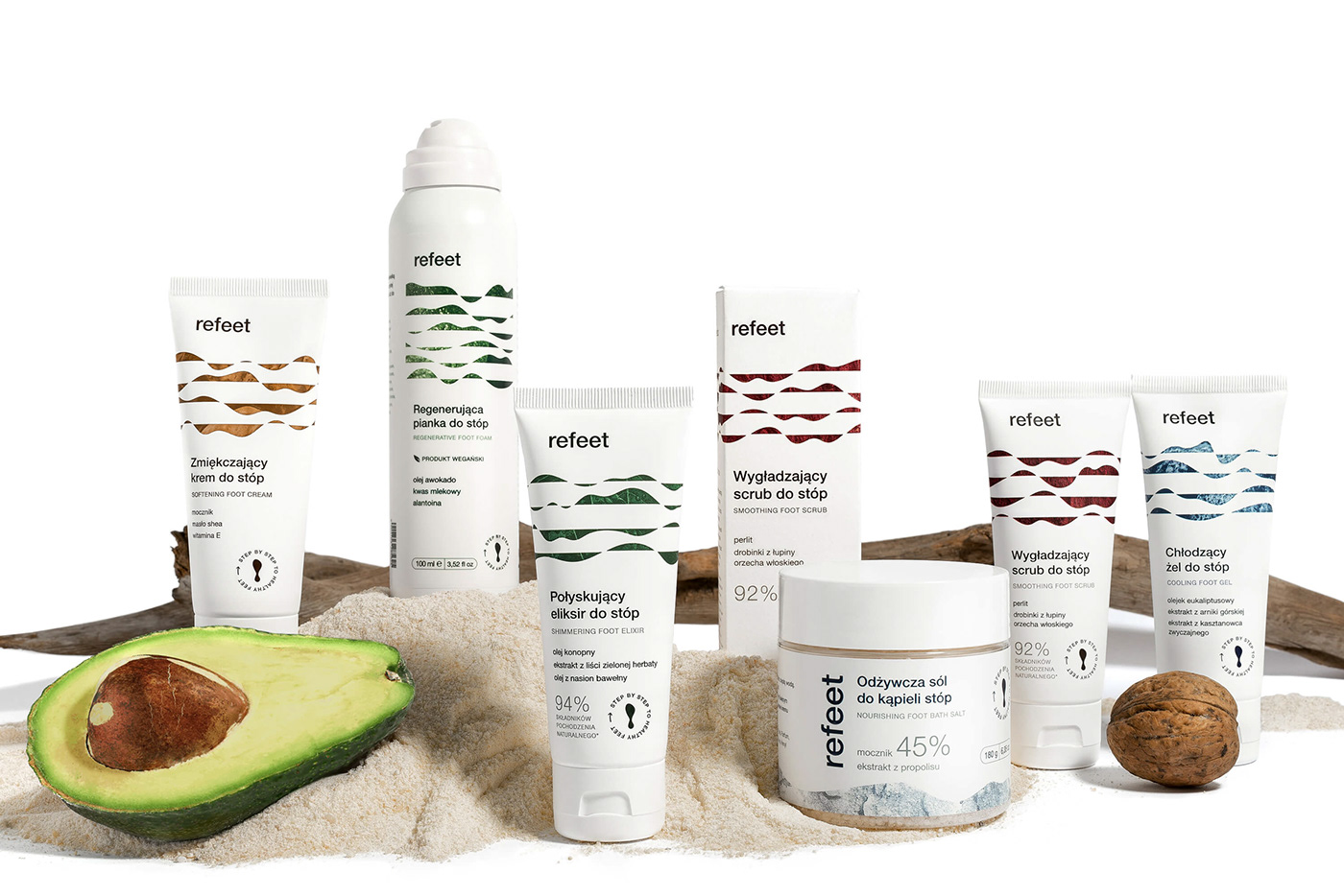
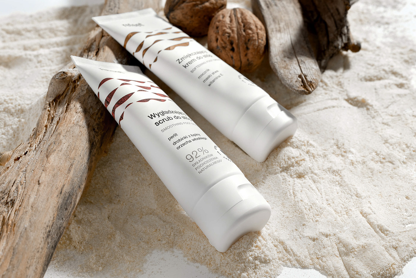
Refeet is a brand that dedicates its entire portfolio to professional foot care. Everything that is necessary for the good condition of the skin and nails and the healthy appearance of the feet is included. As a bonus, this daily care routine is a pleasure.
Idea. Step by step to healthy feet:
Two key inspirations were used to create the refeet brand. The first is nature. The second is the road concept. At the very beginning of the work, we asked ourselves: Is it possible to interpret feet in isolation from nature, soil or roads? In our opinion: no. We are always in touch with the earth. We leave traces on every path we take. However, it works both ways. Our daily journey leaves traces in us, and everything we do leaves an imprint on our body. Herein lies the opportunity to be renewed. The need to take care of the feet emerges.


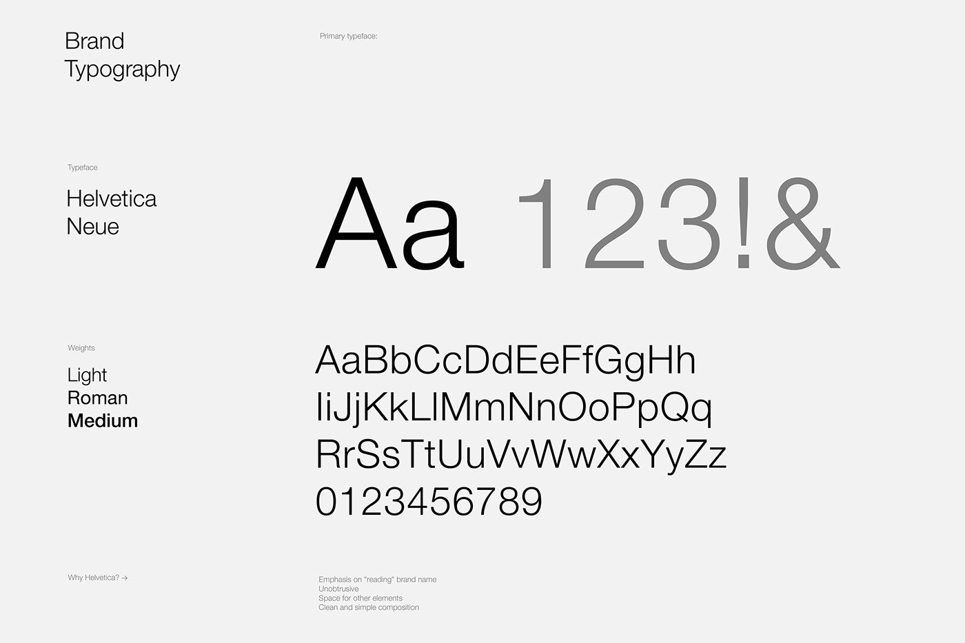
Naming and logotype:
The name refeet primarily speaks about the product. It is short, simple and direct. It contains an explanation of what this product is for and what you can gain by using it. There is a strong suggestion of regeneration or restoring your feet to their optimal condition (re-turn, re-set, re-fresh)
At refeet, the most important thing is the concept of renewal and the story the brand tells. Therefore, the name in the logo is in its simplest form. We're not pretending. Refeet is professional, trustworthy and direct. The recipient's attention should focus on the entire visual language.


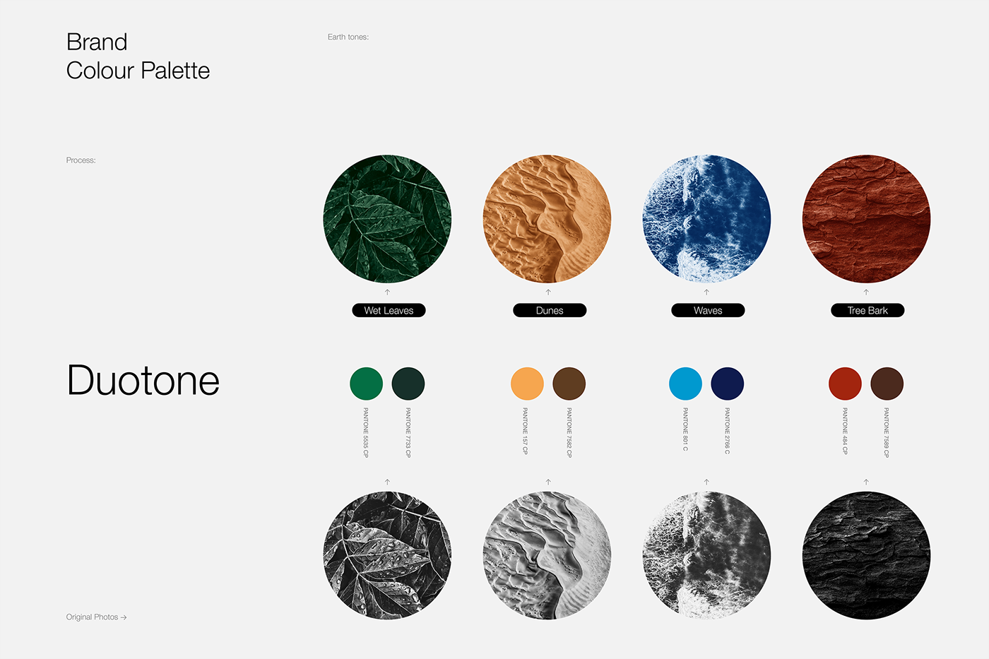
Visual language. Key assumptions.
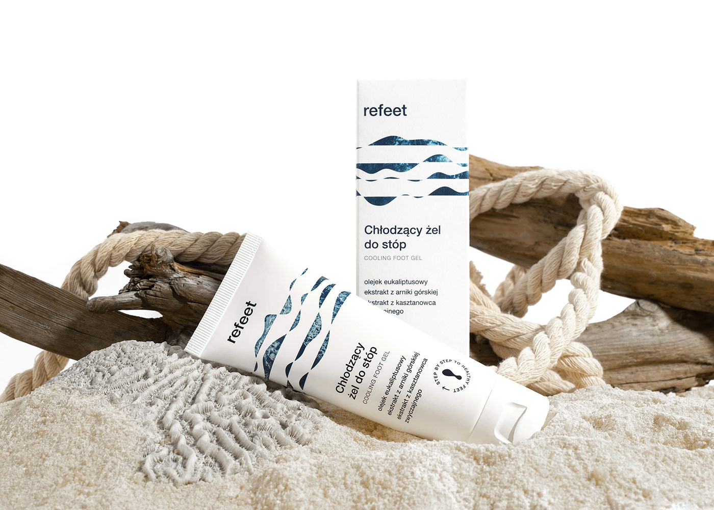
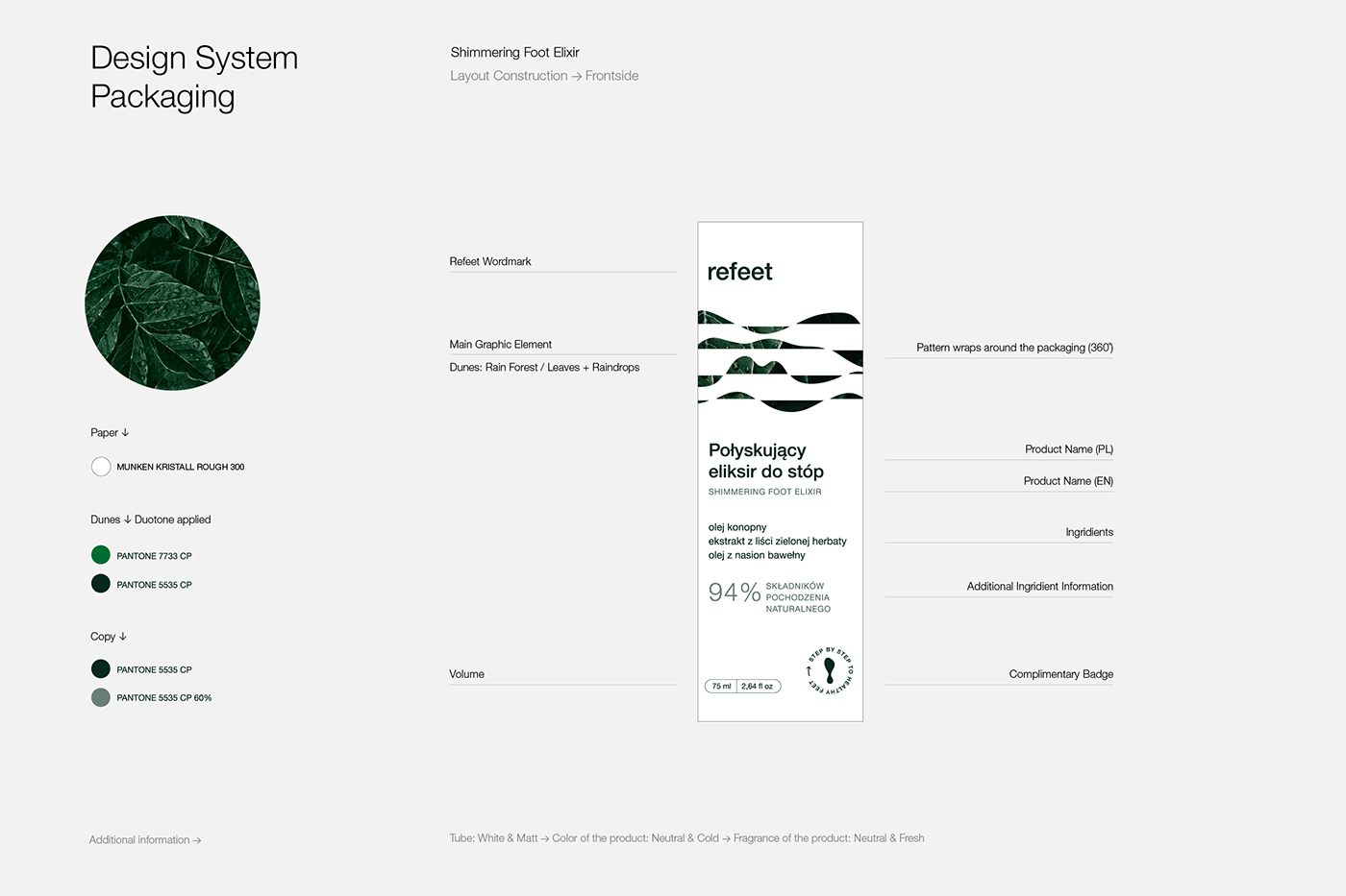
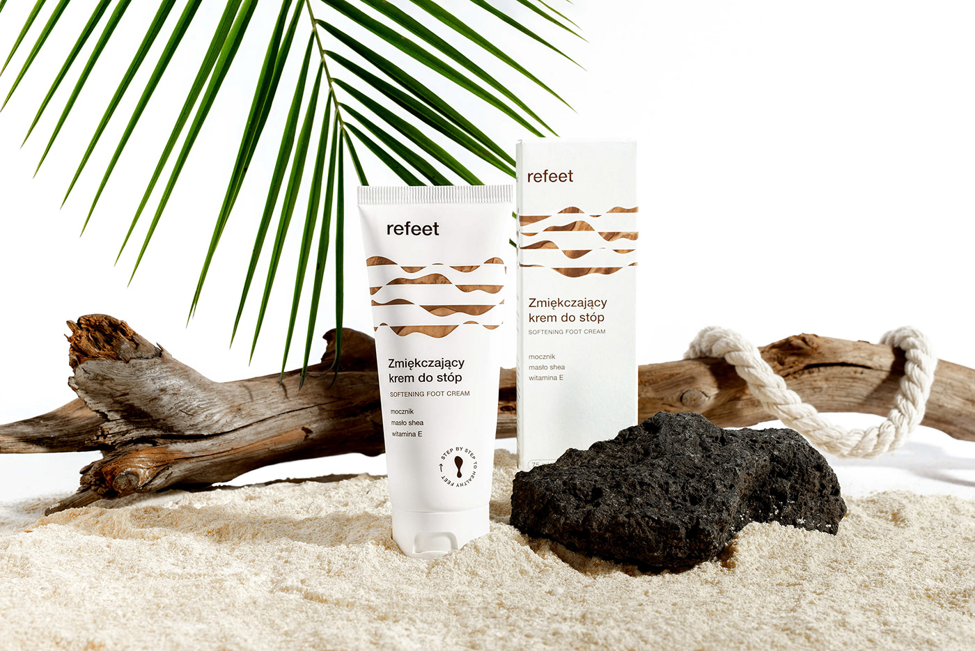
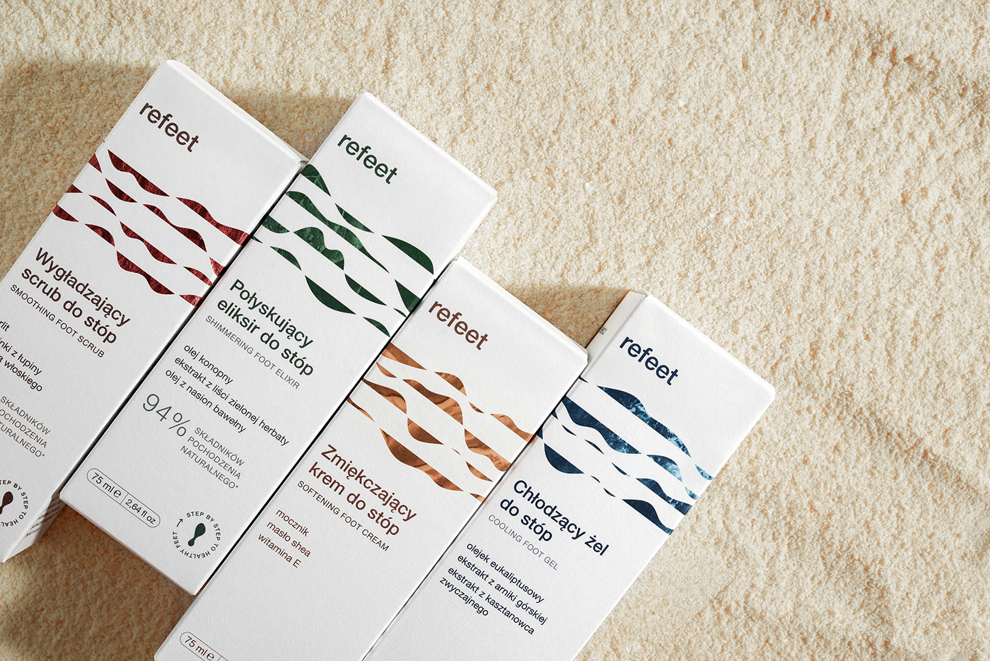
360˚ Patterns:
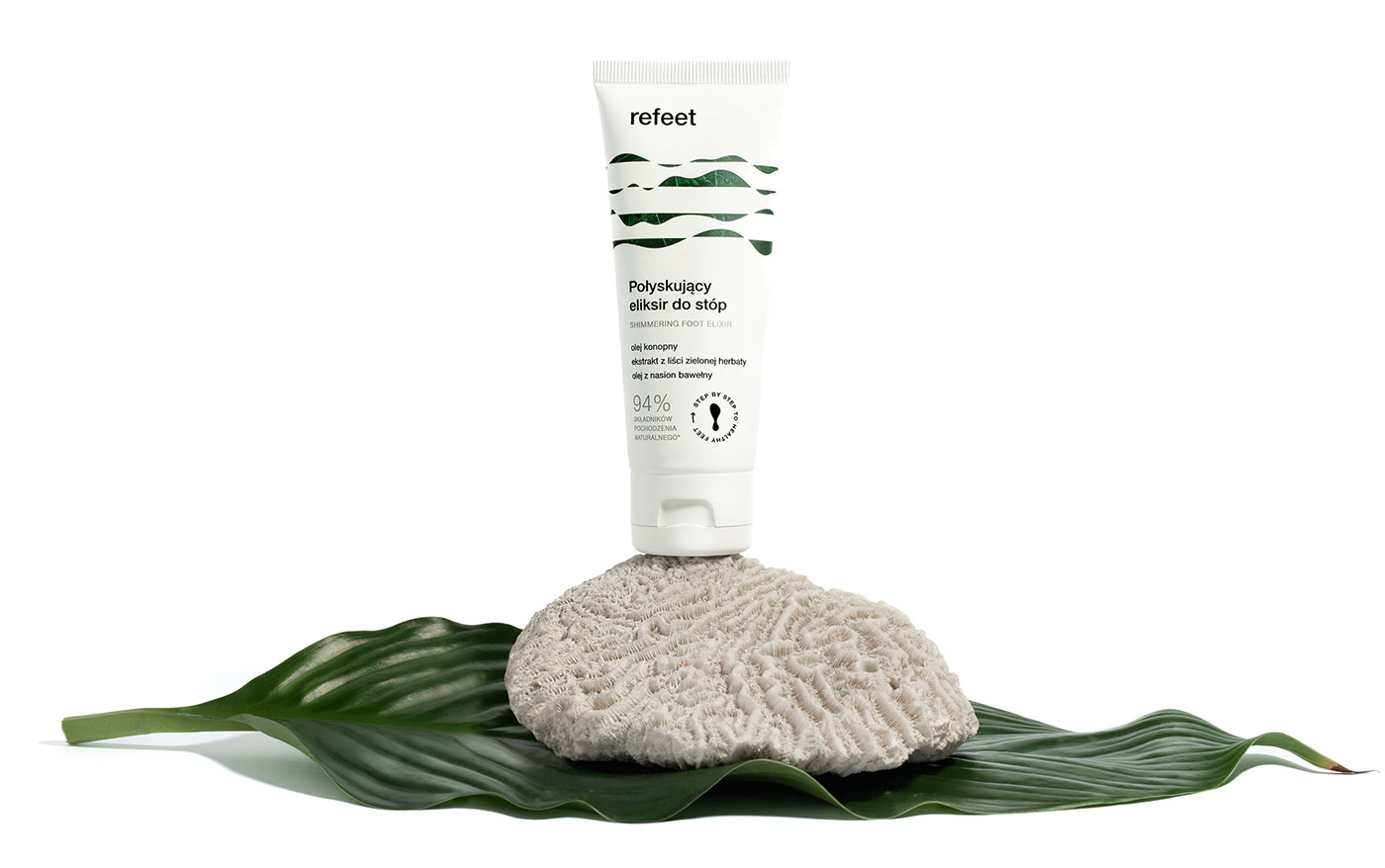
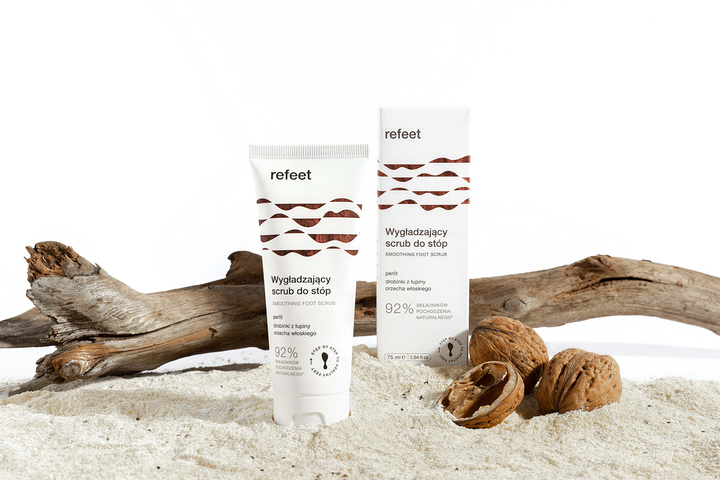
The foundations of refeet's identity are nature, minimalism and sincerity. In the packaging layouts, the most important design assumption was the purity and consistency of the composition.
Refeet's visual language draws directly from nature and the metaphor of the road concept. We designed a pattern that allows creation of abstract forms referring to these inspirations. These forms reflect: dunes, waves, footprints, or an endless road. For each product, we used masking to create patterns that reflect nature and wrap around the packaging.
The whole concept is complemented by a color palette based on earth tones.


Credits:
Michał Markiewicz: Strategy, Naming, Logo, Visual Identity, Packaging, Print
Edyta Mucha: Packaging, Print, Animation
Axela Frank: Product Photoshoot
For more visit:
Thank you!